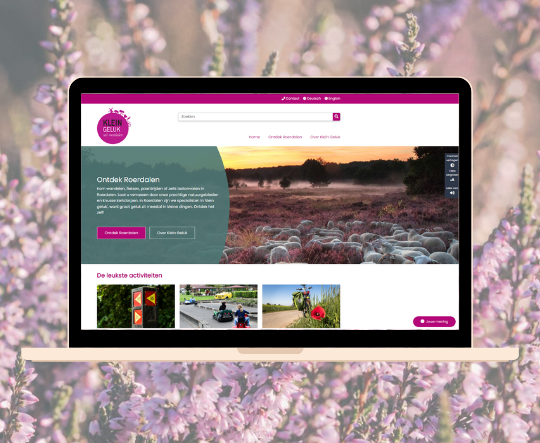
Partnership creates attractive functional city marketing website
The municipality of Roerdalen wanted to develop a new city marketing website. It had to look playful and fresh, display lots of images, and be accessible. Another requirement was a flexible homepage that would suit the campaign-oriented work of the Communications team. Was that feasible with SIMsite powered by Drupal? The municipal team had its doubts.

The communications team and colleagues from the municipality's tourism department discussed their wishes for the new website with Shift2. Webmaster Bianca Peeters-van Elteren: "We already work with Shift2 for the municipal website and the previous tourism site, but found the available templates too static. As an example, we showed them the Visit Zuid-Limburg website. We like the playfulness and many visual elements on that website. Shift2 does not offer anything like that, but consultant Marc van Tintelen was convinced that they could offer a template that combined our desired design with the technical possibilities."

Partner in crime
Together, they set to work. The municipality of Roerdalen opted for city marketing under the banner 'Small happiness from Roerdalen'. The city marketing website forms an important basis for this. Within the happiness concept, specific products have been developed with 26 places of happiness forming the common thread. This unique concept and its accompanying philosophy had to be given a clear place on the website. In addition, there had to be room for further tourist and recreational offerings under the heading 'Discover Roerdalen'. Bianca: "It was quite a challenge to integrate these two parts. They are equally important and both had to be given a place on the homepage without making it look cluttered. It had to remain clear, playful, and calm. Marc was a real partner in crime in this, contributing ideas and making good suggestions for the structure, so that it still fit into an existing template."
Successful Small Happiness
"Www.Kleingelukuitroerdalen.nl shows that Shift2site powered by Drupal offers many more possibilities than we initially thought," Bianca says enthusiastically. "The website invites visitors to click through. We received positive feedback in the survey we conducted among residents and entrepreneurs and in the emails people can send us via the website. The website is associated with cheerful, beautiful, and modern. Its findability scores positively. And in terms of form and content, people find it logical, attractive, and informative."
Walking and cycling routes
Good accessibility is also essential. This is not just about the standard buttons 'increase contrast', 'read aloud' and 'enlarge text', which are of course included. Bianca: "We still have some wishes. Visitors to the website would like to see maps with cycling and walking routes. Shift2's geo solution doesn't work well for this. But we don't want to post PDFs, as they don't meet accessibility requirements. We have now created our own maps using Google Maps in combination with junctions. It's not an ideal solution, but it meets the needs of our visitors."
Good card solution
As a tip for Shift2, Bianca would like to share something about functionality: "Make sure you have a good map solution. That's crucial, and it's better to anticipate the requirements for this type of website. And consider what you include at the development level, for example in new templates. At least if Shift2 also wants to focus on municipal tourism websites.
We are extremely satisfied with the service and support. You really have a partner who brings relevant experience and goes the extra mile to achieve great results together. On a scale of 1 to 10, I'd give Marc an 11 in that regard," she concludes with a smile.
Are you also looking for a city marketing website?
We would be happy to tell you what we can do for your organization.