Opmeer Housing Association on usage tests
Suppose you want to terminate your lease. Would you click on the 'move' button? Housing association Opmeer used questions like this to investigate whether the route and names of various processes on its website are clear to users. This yielded valuable insights, such as the difference in perception between young and older tenants. How did these insights influence the design of the new website?

If you want to rent a home in the municipality of Opmeer, or if you are already a tenant, you will quickly find yourself on the website of Woningbedrijf Opmeer. In order to improve services to tenants and house hunters, the website was revamped at the end of 2020. This project was carried out in collaboration with Shift2 over a period of approximately six weeks. Simone Onneweer, policy officer at Woningbedrijf Opmeer: "It was a challenging process, but the site really needed an update, both in front of and behind the scenes."
Warm and personal
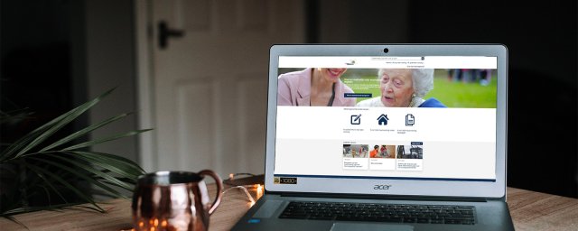
"In an initial meeting, Shift2 (formerly SIM) gathered our ideas and wishes. These could be grouped into three points. For example, it was important to improve the look and feel. Above all, we wanted the website to be warmer and more personal, with more color and beautiful photos of people. Developing the format for this was a lot of fun," Simone says enthusiastically. "We tested it among users. It's instructive to see how everyone views and experiences such a website. For example, a young tenant thought it was a shame that the homepage featured a photo of an older person. Whereas we had deliberately chosen that photo because it showed both an older and a younger person. The new website now also fits in much better with the house style of the municipality of Opmeer, of which we are a part."
Structuring from the customer's perspective
A second point was structuring the information. Which information should be at the forefront and is it easy to find? Simone: "Previously, the information was presented more from the perspective of our housing association. Based on what we thought was important to our customers and what we wanted to tell them. Based on user tests, we started looking at things from the customers' perspective. What information do they search for most? What do they want to know? And do they recognize the names of things? Is the routing clear? These kinds of issues were addressed. We structured the site based on the results. For example, 'register' and 'terminate lease' have become top tasks. They are prominently displayed on the homepage, as is 'submit a repair request'. Very useful for tenants and house hunters."
Arrange online
The third point was improving online services. "Our customers are used to calling, but now much more can be arranged online. These options are also more in line with the times," Simone explains. "Take submitting a repair request, for example. It saves the tenant time by reporting it online, because it goes directly to the right department. An additional advantage is that the customer contact center (CCC) no longer has to record and forward technical reports. The CCC can now use the time freed up for other questions."
150% better
Simone is very pleased with the result. "The look and feel is 150% better. The top tasks are very useful and tenants can now arrange more online." As far as she is concerned, a good foundation has been laid. "We still have a few actions and wishes on our list. For example, some text adjustments are still needed to better match the terminology used by users. An online form for reporting nuisance, frequently asked questions, and arranging automatic rent payments via Digid are also still on the agenda. The goal is always to give customers more clarity about the possibilities. We want to make it as easy as possible for them," concludes Simone. Just like Shift2.
Curious about the result? Take a look at the Woningbedrijf Opmeer website here.
Curious about the possibilities for your website?
We would be happy to tell you what we can do for your organization.