How BAR Waste Management completely revamped their online image
In December, consultant Nick embarked on a new challenge at BAR Waste Management: transforming an outdated website into a fresh, up-to-date, and user-friendly space for residents. Together with Joyce and Gaby, he set to work and turned it into a project they can all be proud of.
Why the BAR Waste Management website needed to be revamped
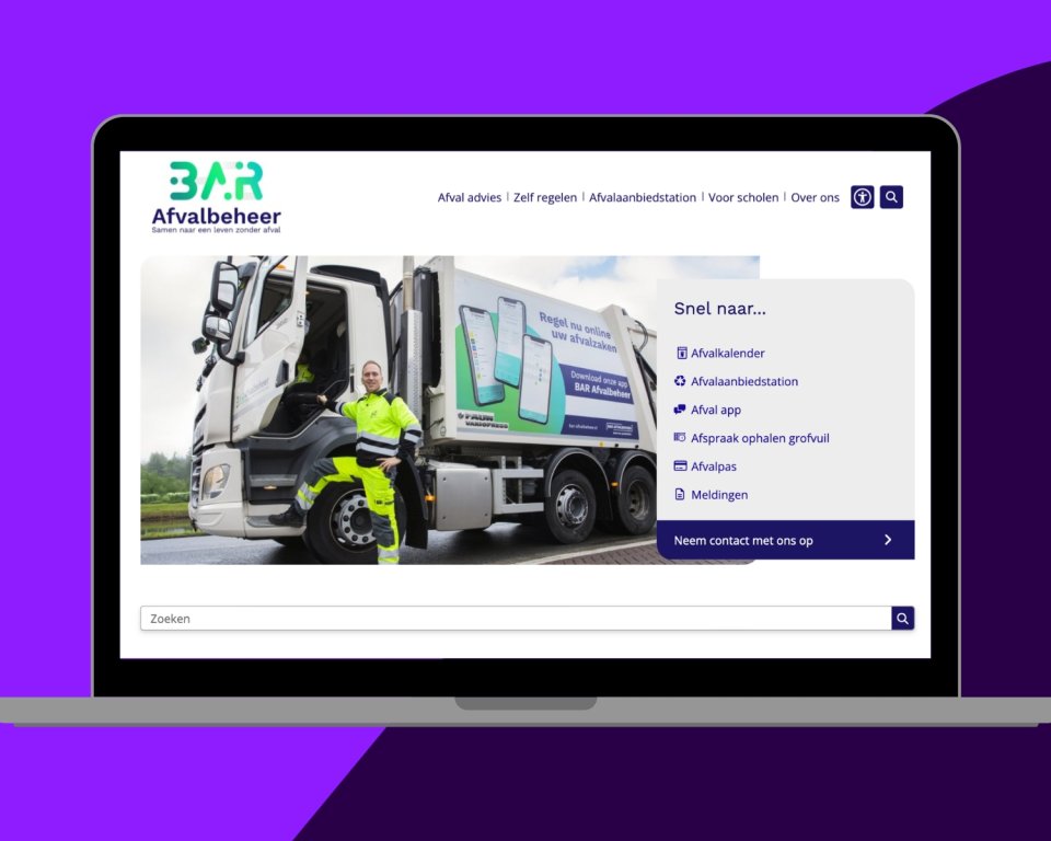
During my first visit to BAR Afvalbeheer last December, it became clear that a BAR Afvalbeheer website revamp was sorely needed. Their municipal website and online image were in dire need of a major overhaul. The content was outdated, the design could be greatly improved with the new options in the CMS, and the CMS itself needed cleaning up. In short: it was time for a revamped website with fresh ideas and smart solutions.
Step by step towards innovation
We started the project by identifying all the wishes and goals. The vision was clear: up-to-date and relevant content, a design that matches the corporate identity, using all the new possibilities, but above all a website focused on the users.
Using a Treejack test, we mapped out how users experience the website structure, enabling us to make targeted choices for the ideal structure and navigation.
We then rebuilt the website from scratch. Every element was given attention: from clear and up-to-date texts to attractive visual details. Joyce and Gaby worked hard during this project to improve all the content. I was there to support them in getting the most out of the CMS.
Quick thinking for a suitable result
As with any project, new requirements emerged during the process that were not yet possible. Thanks to our developers, these requirements were quickly addressed and implemented before the launch. One of these requirements was to round off the corners of the side menu, as this fits in perfectly with the corporate identity.
Renewed design with an eye for detail
I am particularly pleased with how we have effectively utilized all the new design options. These include visually appealing heroes, subtle rounded corners to ensure everything complies with the house style, and fresh and dynamic hover effects. In addition, accessibility has been greatly improved, both in terms of content and functionality. For example, the new button is used for accessibility options.
My personal favorite? The unique footer border, designed by Joyce and Gaby. A small detail (only 80 pixels high), but a very nice and fitting one.
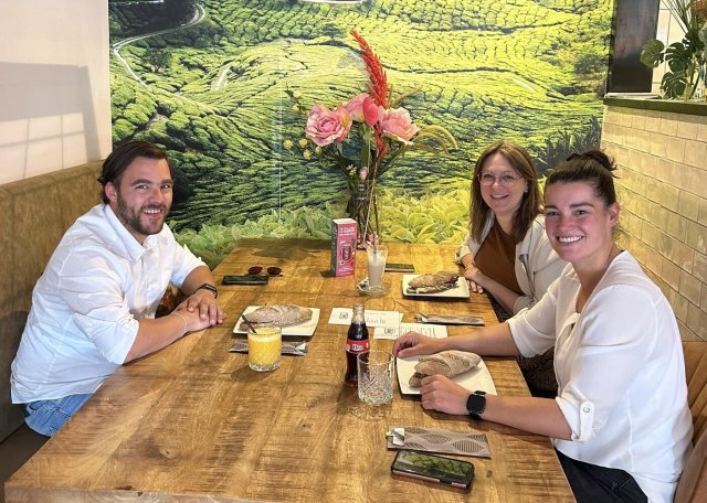
Collaboration with impact and enjoyment
In addition to the beautiful end result, working with Joyce and Gaby was fantastic. Their drive and dedication to improving the website, as well as the fun project days, really made a difference. Together, we have created something beautiful that everyone can be proud of.
What made the collaboration special was the great chemistry we had right from the start. I really enjoyed sending them a small gift to mark the launch, and Joyce and Gaby surprised me with a card when my new house was renovated and ready.
Joyce: “We are very happy with the revamped website. What started as a challenge has grown into something we are proud of and receive many compliments about. The collaboration was great: you were always there for us and responded quickly. We hope you will be part of our next project.”
A fresh start
On June 1, BAR Afvalbeheer's revamped website went live at . A website that is not only completely up to date in terms of content and technology, but also ready for the future in terms of appearance and ease of use.
It was a very enjoyable and productive process full of creativity. I look back on it with great pleasure.
Is your municipality or organization ready for a fresh, user-friendly website?
Let's explore the possibilities together. Feel free to send me a message!
Nick van de Venn
s Consultant at Shift2