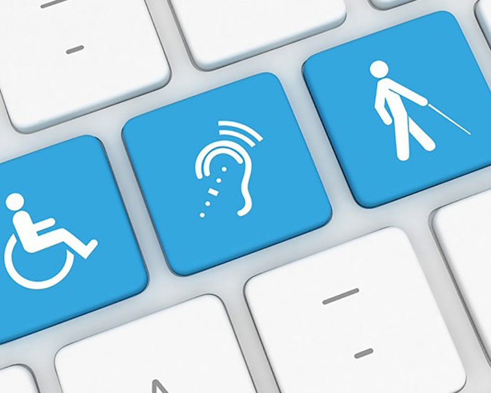
Accessibility: three practical tips!
Every resident has the right to live like everyone else and participate in society. Making use of the opportunities offered by the internet, computers, and smartphones is naturally part of that. That is precisely why it is important that digital services are accessible to everyone. We offer three practical tips for making text accessible to your residents.
1. Use Alt text correctly
Alt text is added to an image to inform visitors with visual impairments what the image is about. If you follow this guideline to the letter, you will add Alt text to every image. Right? The question is whether this actually helps visitors with visual impairments. To be honest, this is often not the case. It actually gives them too much information, which does not improve clarity.
Why use alt text?
Visitors with visual impairments often use screen readers. This additive technology ensures that all elements on a web page are read aloud. In addition to text, screen readers also read aloud elements on the page such as images, form fields, tables, headings, and links. In practice, when encountering an image, the screen reader reads the Alt text of the image, followed by the name of the element. For example, for an image of a man on a horse, the screen reader will first read the Alt text "man on horse" followed by the name of the relevant element, image.
How does a screen reader read aloud?
Images generally always convey information. However, in most cases, this information is already contained in the text, the headline, or the link.
Stel: de tekst 'Wegwerkzaamheden' in het hierboven genoemde voorbeeld is een link <a> en de afbeelding <img> krijgt de alt tekst 'bord wegwerkzaamheden '. De screenreader zal de afbeelding met tekst dan als volgt voorlezen: bord wegwerkzaamheden (Alt-tekst) - afbeelding vervolgens wegwerkzaamheden - link. Wanneer je nu de Alt-tekst bij de afbeelding leeg laat, zal de screenreader de afbeelding negeren en wordt de afbeelding met link voorgelezen als: Wegwerkzaamheden - link. Dit laatste is voor je bezoeker met een visuele beperking veel duidelijker. Laat de 'Alt-tekst' bij afbeeldingen daarom leeg, tenzij de afbeelding informatie bevat welke niet in tekst, kop of link staat.
2. Aligning to the left is a must!
Text is accessible in itself. In addition to the use of clear headings and titles, the way in which text is presented (line length and alignment) is also essential for readability.
Alignment determines the appearance and orientation of the edges of the text block. Right alignment, centering, or justified text are not options when it comes to accessibility. Left alignment is the clearest option. With left alignment, the front of the text lines form a vertical line. This so-called fixed starting point makes reading more effective and less tiring. Especially for people with cognitive impairments, such as attention problems or dyslexia, left alignment of text provides a calm image. For the visually impaired, left alignment is a must, as it is used here as a reference point when scrolling horizontally.
Line length is also very important. The ideal line length for desktop is estimated to be a maximum of 120 characters, including spaces. Dividing text across two columns is not an option, as this makes the page difficult to scan. This is also highlighted in the Nielsen Norman Group's study 'Improving Usability for Low-Literacy Users'.
3. Create understandable links
Even without context, it should be clear where links lead to. Link text such as "click here" or "read more" is not clear if you cannot see the surrounding text or visual presentation. It is a common pitfall, for example, to provide more information on the news page for the messages linked to "read more." For visitors without disabilities, this means reading back a little; they can quickly see what to expect when they click on the 'read more' link. For people who use a screen reader, this is more difficult to understand.


